Custom Search
Showing posts with label Photoshop. Show all posts

Monday, September 6, 2010

How to Create Newspaper Layout In Photoshop

This tutorial will show you how to create an image that will look like a scanned newspaper page.


Newspaper Layout In Photoshop


Step 1. Create a new document, size 630x900 and fill it with it a light, warm gray (color code #e4e4e4).

Step 2. To make the final result make more realistic, it’s necessary to mimic the way you can see the writing on the back page on a real newspaper.

To achieve this effect, open an image of a newspaper page you can find on the Internet (I chose this one), go to Image-> Rotate Canvas -> Flip Canvas Horizontal and then copy/paste it over the new document you just created. Set its opacity to 5%, so that the writing is only a bit visible.

Newspaper Layout In Photoshop

Step 3. Newspaper articles often contain pictures, so I opened this one and resized it to 35%, and I placed it on the left like this:

Newspaper Layout In Photoshop

Step 4. To convert the image to black and white, the best method is to go to Image -> Adjustments -> Channel Mixer… tick Monochrome and leave all the other settings as default.

Newspaper Layout In Photoshop

Step 5. In order to create the headlines, I used Century Old Style Std, Italic, size 40pt and 24pt respectively. You may use any other font that is very legible and simple.

Newspaper Layout In Photoshop

Step 6. To create the subtitles, I used Century Old Style Std, Bold, size 18pt. I left some space between them and the picture, and the headlines, in order to achieve an elegant, uncluttered look.


Don’t worry if the text you’ve done until now is not properly aligned. You can easily fix that later.

Step 7. Now it’s time to create the content of the news article. You need to create a text box: using the Type Tool, click on the desired starting point of the text box and drag down to create a rectangle.

Newspaper Layout In Photoshop

Though it’s not visible in the screenshot above, the text box doesn’t go all the way to the bottom of the page. I’ve left a blank edge on the bottom of the page, because we’re later going to add the date and day of the week there, just like on genuine newspapers.

Step 8. Paste some text of your choice into the text box you’ve created (my source was Wikipedia). The font I used is Century Old Style Std, Regular, 14pt.

Newspaper Layout In Photoshop

Notice that I’ve used a Sans Serif font. Because of their high legibility, most magazines and newspaper articles use Sans Serif fonts for the main body of text.

Step 9. Create a second text box as shown at step 7 and paste some text, using the font at step 8.
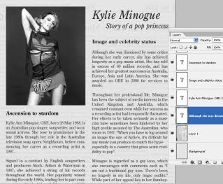
Newspaper Layout In Photoshop

Step 10. The final step is to create a text box and add some text in the lower part of the page. I used the font Century Old Style Std, Regular, 12pt.

Newspaper Layout In Photoshop

In order to verify and align the way the text and pictures fit on the page, go to View -> Show -> Grid. To change the position of a certain element, use the left and right arrow keys, or the Move Tool.


The final result:


Newspaper Layout In Photoshop

read more...

Photoshop - Simple Photo Retouching Tutorial

Here is the step by step detail on how to retouch photo using Clone Stamp Tool in Photoshop :

1. Open the photo/file in Photoshop you want to work with for the tutorial (go to the file menu in Photoshop and select open, from the open dialogue box select your desired file and click open.

2. Make a duplicate layer of the image by going to the layer palette and clicking & druging the background layer into the "Create a new Layer" box (located at the bottom of the layer palette and 2nd one from the right hand side). Take off the original background layer by clicking on its visibility icoon. This way we can preserve the original layer and will be working with the duplicate one. Look at the picture below to get a live view.

Photo Retouching Tutorial

Photo Retouching Tutorial

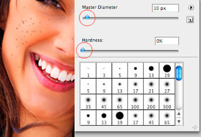
3. Select the "Clone Stamp Tool (S)" from the tool box (if you can't see the tool box, go to window menu and select "Tools"). Click right button on your mouse and an window will pop up where we can resize the clone tool depending on the spot size we are going to remove and as well as the hardness we need to select into 0% in this case. Now we are ready to start retouch and cleaning the spots.

Photo Retouching Tutorial

Photo Retouching Tutorial Photo Retouching Tutorial

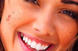
4. Keep in mind that we have to clean every single spot one by one. Not all spots we can remove at a single click. So, decide which perticular spot you are going to touch up first, then press "Alt" on your keybord and click on the fresh portion of the image nearest to the spot where you think the color density is very similar. Release the "Alt" key and click on the spot. You are successfully removed the spot. Take a look at the image below.

Photo Retouching Tutorial

5. In the same manner, touch up all the spots within the image.

One thing I want to notice that, make your tool size perfect (a little bit bigger than spot) and choose the appropriate hardness of the tool. If these things are not choosen appropriately, your image may not look professional after you have done.

Hopping the above tutorial helps you to handle retouching in photoshop.

read more...

Friday, May 7, 2010

How To Create Night Vision Effect In Photoshop

In this tutorial you will learn how to create a night vision effect in Photoshop using the hue and saturation adjustments, blur filter and the burn tool. The night vision effect in this tutorial gives the result of looking through night vision goggles. I have used a free stock image which can be found at sxc.hu.


Night vision effect in Photoshop

Step 1

Open an image in Photoshop. It’s best to use an image which contains some scenery such as buildings or landmarks.


Step 2

Duplicate the background layer by pressing Ctrl + J on the keyboard. Then select Image > Adjustment > Hue/Saturation. Check the Colorize box at the bottom of the dialog window and then give your image a green colour. I have used the following settings, but you can use whatever setting you wish. I have set the hue to 124, the saturation to 43 and the lightness to -36.


Step 3

Add some noise to your image by selecting Filter > Add Noise. I have only added a small amount of noise to my image. The amount I used is 10% and the distribution is uniform.


Step 4

Take the burn tool with the range at Midtones and the exposure at 64%. And paint around the edges of the image. Apply about 5 -6 layers of burn around the edges, so you get a slightly blacken colour.


You should now have a night vision effect.


read more...

Friday, April 30, 2010

Realistic Paper Texture in 5 Minutes

In this quick tip tutorial, we will learn how to create a realistic paper texture from scratch in just 5 minutes. To do this we will use some simple filters and effects. Let’s get started!

Realistic Paper Texture in 5 Minutes

Step 1

Create new file 1280 x 1024 px. Create a rectangular selection in the center of the image, hit Q to enter quick mask mode. Go to Filter > Pixelate > Crystallize, use small cell size and click OK. Hit Q again to return to normal mode. Hit Cmd+shift+alt+N to create a new layer. Press D then Cmd+Delete to fill selection with white. To remove selection press Cmd+D.


Realistic Paper Texture in 5 Minutes

Step 2

Activate the burn tool with exposure 20%. Paint the paper until it looks dark and dirty. Go to Filter > Texture > Texturizer, use Texture: Canvas and click OK.


Realistic Paper Texture in 5 Minutes

Step 3

Double click the paper layer to open the Layer Styles dialog and activate the Drop Shadow effect. Don’t worry with the settings, just click OK. This shadow is very flat and unrealistic, but we’ll fix it.


Realistic Paper Texture in 5 Minutes

Step 4

From the Layers panel, right click Drop Shadow and choose Create Layer. This step will separate the Drop Shadow from the paper.


Realistic Paper Texture in 5 Minutes

Step 5

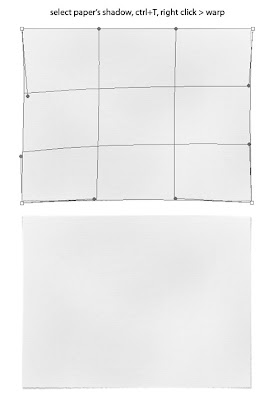
Select the shadow layer, hit Cmd+T to transform it. Right click it and choose Warp. Move the handles until the shadow looks irregular, just like a real one.


Realistic Paper Texture in 5 Minutes

Step 6

Activate the Gradient Tool, in the option bar and choose Linear and Mode: Difference. Create a random gradient, from top to bottom, bottom to top, left right, and right to left. Just go crazy!


Realistic Paper Texture in 5 Minutes

Step 7

Go to Filter > Stylize > Emboss. Hit Cmd+L and move the white and black sliders to the middle.


Realistic Paper Texture in 5 Minutes

Step 8

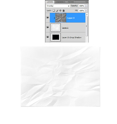
Hit Cmd+alt+G. Change blending mode to Overlay.


Realistic Paper Texture in 5 Minutes

Conclusion

That’s it! You can turn this into a thin paper by lowering its opacity. Below is the final paper on a wood texture. Click here or click on the image to see it in full size.


Realistic Paper Texture in 5 Minutes

Source : psd.tutsplus
read more...

Tuesday, March 2, 2010

Photoshop Brushes - How To Create Cute Faces On Fruits

Step 1 – Open an image of a fruit in Photoshop

Choose File > Open, browse for the image file, then click OK.


Step 2 – Create a new layer

Choose Layer > New Layer to create a new layer. This layer will hold the image of the cute face.


Step 3 – Choose the brush

Make sure that you’ve loaded the brushes into Photoshop. Select the Brush tool then right click anywhere on the document window to see the list of brushes. Pick the face that you’d like to use.


Step 4 – Apply the cute face

Paint the cute face on the fruit. Use the transform tools (Edit > Transform) if you like to distort the face.


Step 5 – Blend the face into the fruits texture

Choose Layer > Layer Style > Blending Options. On the bottom of the window, hold the alt key then drag the white input slider towards the left until the face looks like it is drawn on the fruit. Click Ok when done.


Final Results


[VIA]
read more...

Create Symbols Spray In Adobe Illustrator

Say, you want to draw a tree in full Spring, a very green one. Not just an outline you want details too so that you actually see the leafs. Unless you have a ton of time on your hands or you’re paid by the hour, it would be a hell of a job to draw each leaf one by one. This would be one of the many situations where the Symbol Spaying Tool can be of assistance.

Step 1 - Create a few symbols to spray with

First of all you need to create a few symbols to have a bit of variation to work with. Instead of creating a symbol of only one leaf, I suggest to draw groups of leaves and make them separate symbols. To do this, just select the group of leaves and drag & drop them in the Symbols palette. I've used different shades of green for my leafs.


Step 2 - Set the Symbol Sprayer Tool

The second step is to double click the Symbol Sprayer Tool in the Toolbox and adjust the settings to your wishes. This can be a bit tricky and you might need to experiment a bit to find the setting that fits your purpose. I've used an intensity of 7 and a Symbol Set Density of 5. Furthermore I've changed all dropdown menus to "User Defined".


Step 3 - Let the fun begin and spray like you've never sprayed before

Once you've discovered the desired setting you can start spraying around. Oh and you don't have to worry about damaging the ozone layer here, you can spray like a madman :) Just click and drag, release the mouse when you think that there are enough leaves. I usually deselect each time I've released the mouse. This way you have all separate sprayings, so you can move them around and rearrange them a bit if needed.


Don't stop experimenting

If you're still not satisfied with the result, you can also tweak a bit by using the Symbol Shifter, Cruncher, Sizer, Spinner, Stainer, Screener or Styler Tool. These tools are hidden under the Symbol Sprayer Tool when you select and hold down the mouse. Think about the possibilities here in this tool and the amount of time you can save: a field full of flowers, a sky full of birds,... Ah Spring, can't wait till it's here. The weather forecast isn't looking that bad for this week.

Hope you enjoyed this tutorial.


[VIA]


read more...